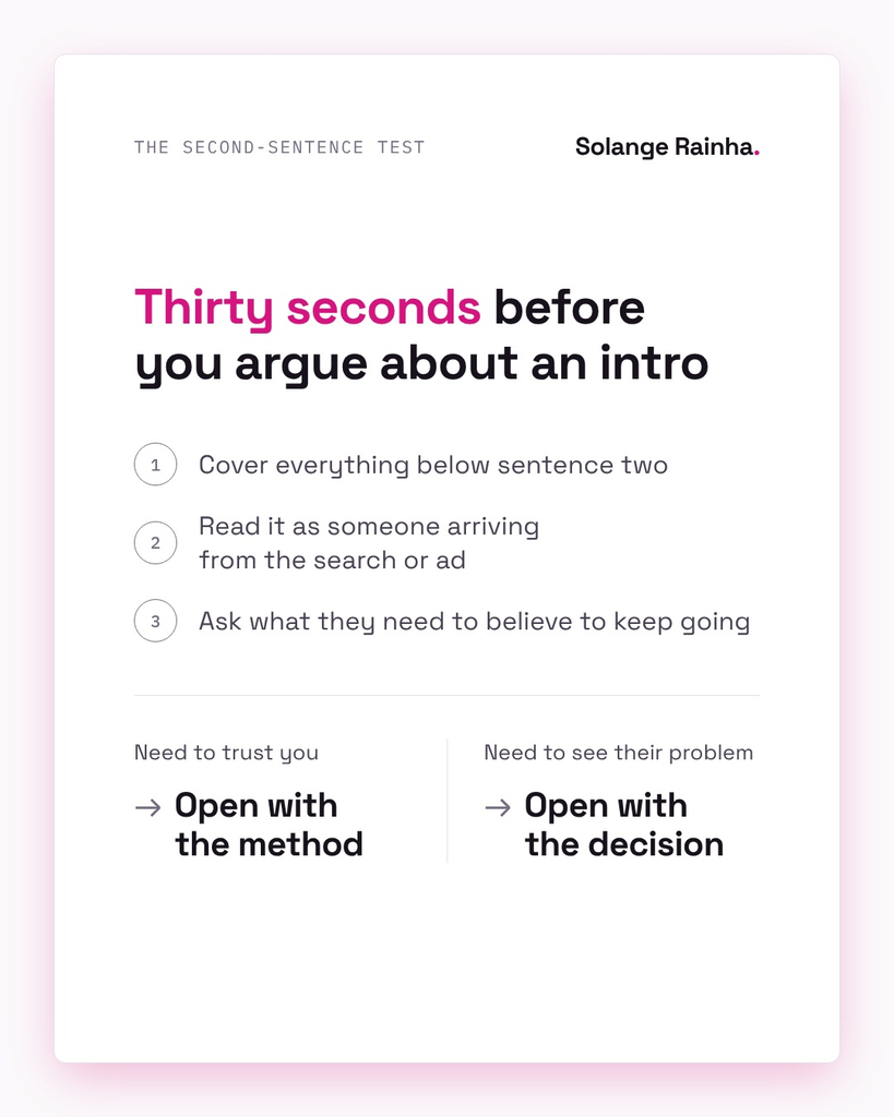
Open with whatever the reader needs to believe before they’ll read your second sentence. Method guides and comparison pages lead with the method, since their visitors are checking whether you know the subject, while buyers on a homepage or use case page show up with a decision they’ve half made and need to see it’s about their problem, so you open on that choice.
Every page opening I write starts with one question about the person landing there: are they here to check me, or the fit? Most teams pick what goes first by habit (I covered openings in general in writing strong openings).
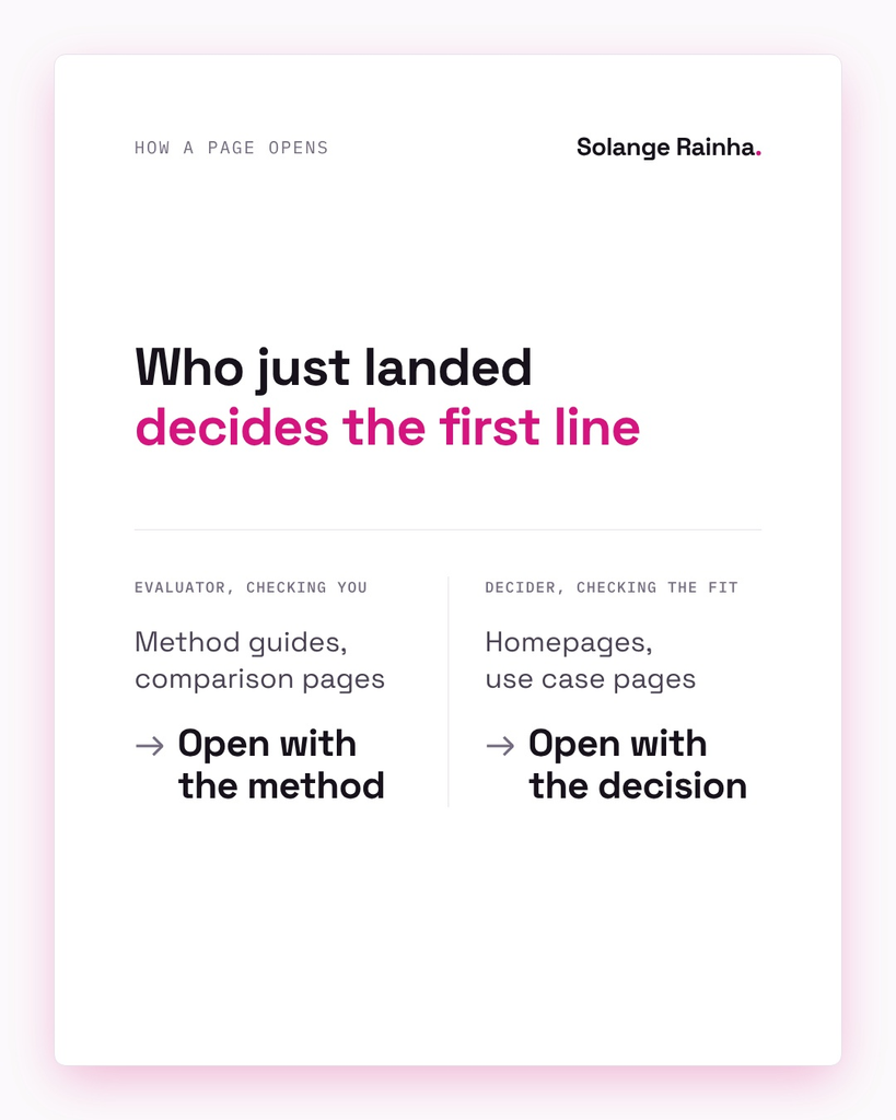
What decides how a page opening should start?
The reader’s state on arrival decides it, and page type makes a decent stand-in. I split arrivals into two kinds: evaluators come to check a claim, like how a method works or how two options compare, and they’re also testing whether the writer knows a technical topic well enough to trust. Deciders already have a choice to make and want to know, fast, whether this page helps them make it.
Copywriters have worked with a version of this split since Eugene Schwartz published Breakthrough Advertising in 1966. His five levels of awareness set the opening by how much the prospect knows at the start, and Sandy Franks’ summary for AWAI says the job with a reader who’s already comparing options is “proving your product or service can solve the problem”, which describes my evaluator.
Jakob Nielsen’s web usability study found 79% of users scan instead of reading word by word, and Amy Schade’s piece on the inverted pyramid for Nielsen Norman Group gives the reason for putting the point first:
“Users can quickly form a mental model and a general understanding of the article.”
The inverted pyramid doesn’t say which idea leads, though, so this table sets what the first 75 words carry on each page type.
| Page type | What goes in |
|---|---|
| Method guide | Give a standalone definition and say when the method fits. |
| Comparison | List your criteria and sources, with the date you checked them. |
| Use case | Name the choice and who faces it, then say what changes. |
| Homepage | Say who it’s for and what they get. |
Why do method readers want proof of competence first?
They usually have to explain what they learn to someone else. A person reading a guide to a pricing or survey method is often the one who’ll present the results, so they want proof the writer understands the method’s assumptions and limits. Open that page with “set the right price in a week” and the evaluator reads sales copy and goes back to the search results.
Comparison pages add suspicion, because the reader assumes the vendor rigged them, so the opening shows how you tested the tools before you give any verdict. I argued that in full in how to write a B2B comparison page.
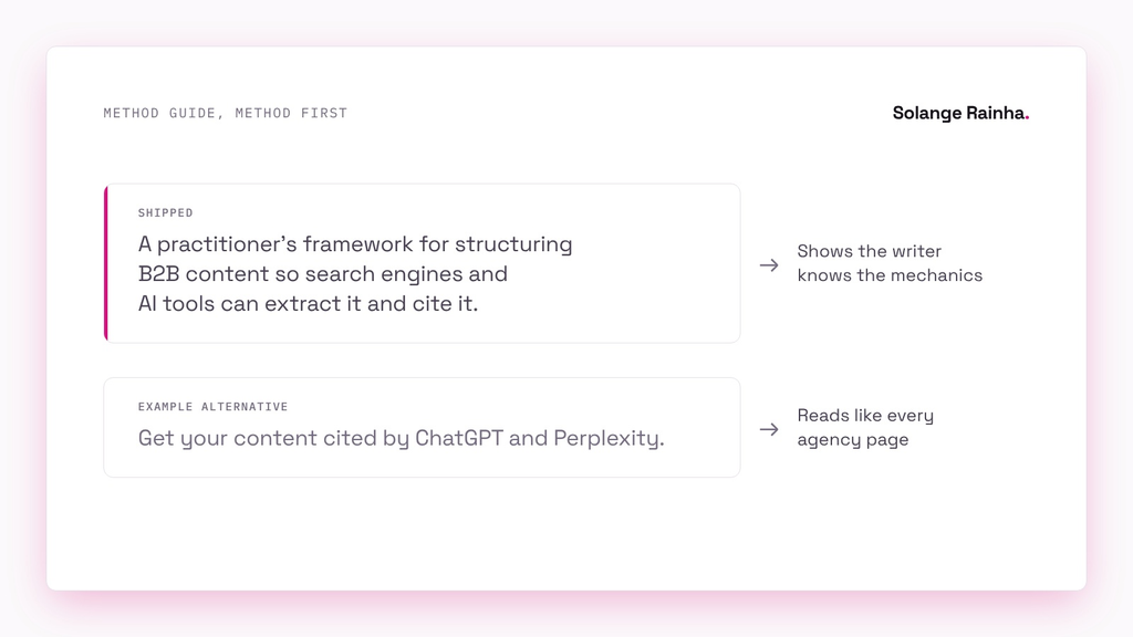
My own AEO/LLMO content optimisation framework is a method page, so it opens like this:
“A practitioner’s framework for structuring B2B content so search engines and AI tools can extract it and cite it.”
An outcome-first version would have led with the payoff, with something like “Get your content cited by ChatGPT and Perplexity”, which is punchier and worse, because framework readers are practitioners checking whether I understand the mechanics and every agency landing page already promises citations.
Why do buyers on homepages and use case pages want the outcome first?
Deciders don’t care how it works until they know it’s for them. When I worked at renewable energy SaaS company Cleanwatts, I rewrote the product messaging and user flow on 20+ web pages around buyer types that Sales and I had split by motivation, and session duration rose 25%. The flow changed too, so I won’t credit the openings alone, but every page in the new version started from what its buyer was trying to decide.
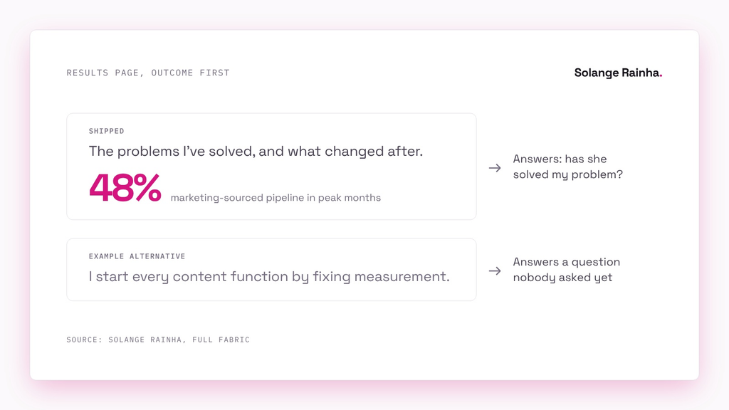
My results page is where my own site leads with outcomes: I wrote it for hiring managers deciding whether I can fix their problem, so it opens on that decision:
“The problems I’ve solved, and what changed after.”
The first of the three figures under that line is the 48% marketing-sourced pipeline in peak months my content operation contributed to at Full Fabric. A method-first version would have opened with “I start every content function by fixing measurement”, which a hiring manager doesn’t need until they’ve seen I’ve solved a problem like theirs.
How does the opening change AI extraction and featured snippets?
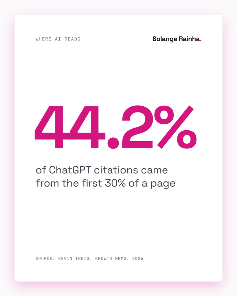
The opening is the part machines read most, so what it leads with decides which questions the page can answer. Kevin Indig’s analysis of ChatGPT citations found 44.2% of them came from the first 30% of a page, and Google describes a featured snippet as a short excerpt it picks because it responds to the searcher’s query. Lead with the method and you match the “what is” and “how does” searches people use to find method guides, while an outcome-first opening suits buyers typing “which should I pick”.
Google’s guidance on helpful content asks whether a page’s main heading gives a descriptive summary of it, and I ask the same of the first paragraph. I cover the mechanics in my tactical guide to AI-citable content and in how to write definitions.
One caveat: I haven’t seen a study that tests method-first against outcome-first openings for citation rates, and I’ve never done one myself. The rule comes from query matching, so expect me to change it if someone measures otherwise.
When do I break the rule?
I break it when the reader who lands isn’t the one the rule assumes. Most of my breaks happen at the B2B SaaS market research platform.
Its navigation lists use cases as decisions (pricing a new feature, for example), and some of those links land on a blog method guide. Anyone who clicked one is a decider, so the article they reach opens on a story about a company setting its subscription price and leaves the definition for the next section. Readers who arrive by searching the method’s name get a slower start, and I’ve accepted that trade.
The method product pages break it for a similar reason: they lead with trying it yourself and what it calculates, because visitors there already know the method and are picking a tool, and having its name in the URL doesn’t make them evaluators.
Head-to-head pages give a verdict by team type first, including when the competitor is the better buy, and the criteria follow in the second paragraph. Someone weighing two named tools has done the category research already, and admitting where the competitor wins shows fairness the way a method line would. I’d still move the check date up from the pricing section into the first lines, and my earlier comparison pages need the same rewrite, since they open on a price gap.
That company’s homepage keeps the rule and still fits the method in: the headline says what product teams get to measure, and the line under it names the methods, because they’re its main advantage.
Technical buyers are the last break: when EdTech SaaS company Full Fabric moved its primary audience from admissions to IT, the new content led with the architecture, because IT reads use case pages the way evaluators approach method guides (I wrote more on this in technical content for CIOs).
My own homepage is the one I’d do differently, since it opens with “Hi, I’m Solange” instead of the method or the outcome, and the tagline under it uses the exact contrast construction I remove from every draft. By my own rule it should open on the decision a hiring manager is making, so I’ll fix it first in the next rebuild.
What’s a quick test for any page opening?
I use the second-sentence test, which takes thirty seconds: cover everything below the first two sentences and read them as a stranger arriving from whatever search or ad brought them. Then ask what would keep that person reading, and let the answer settle whether the method or the decision goes first (you can explain the method later).